de Velde
Huisstijl GUM
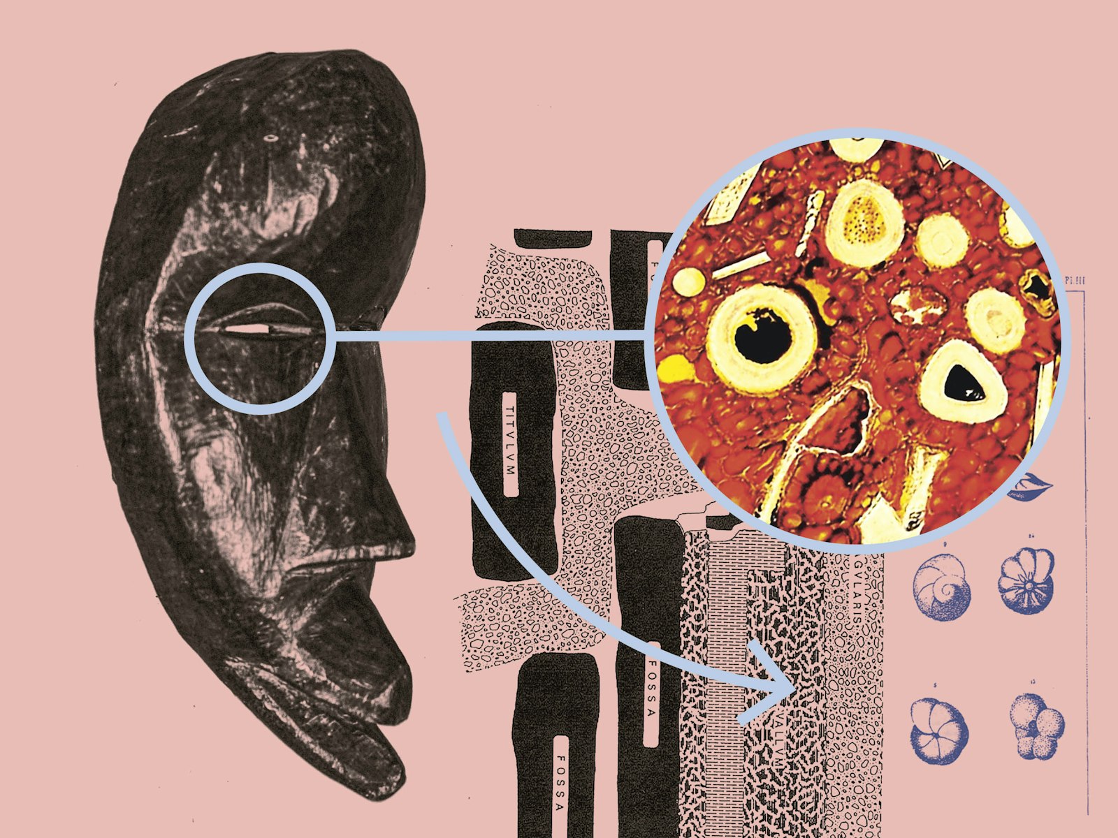
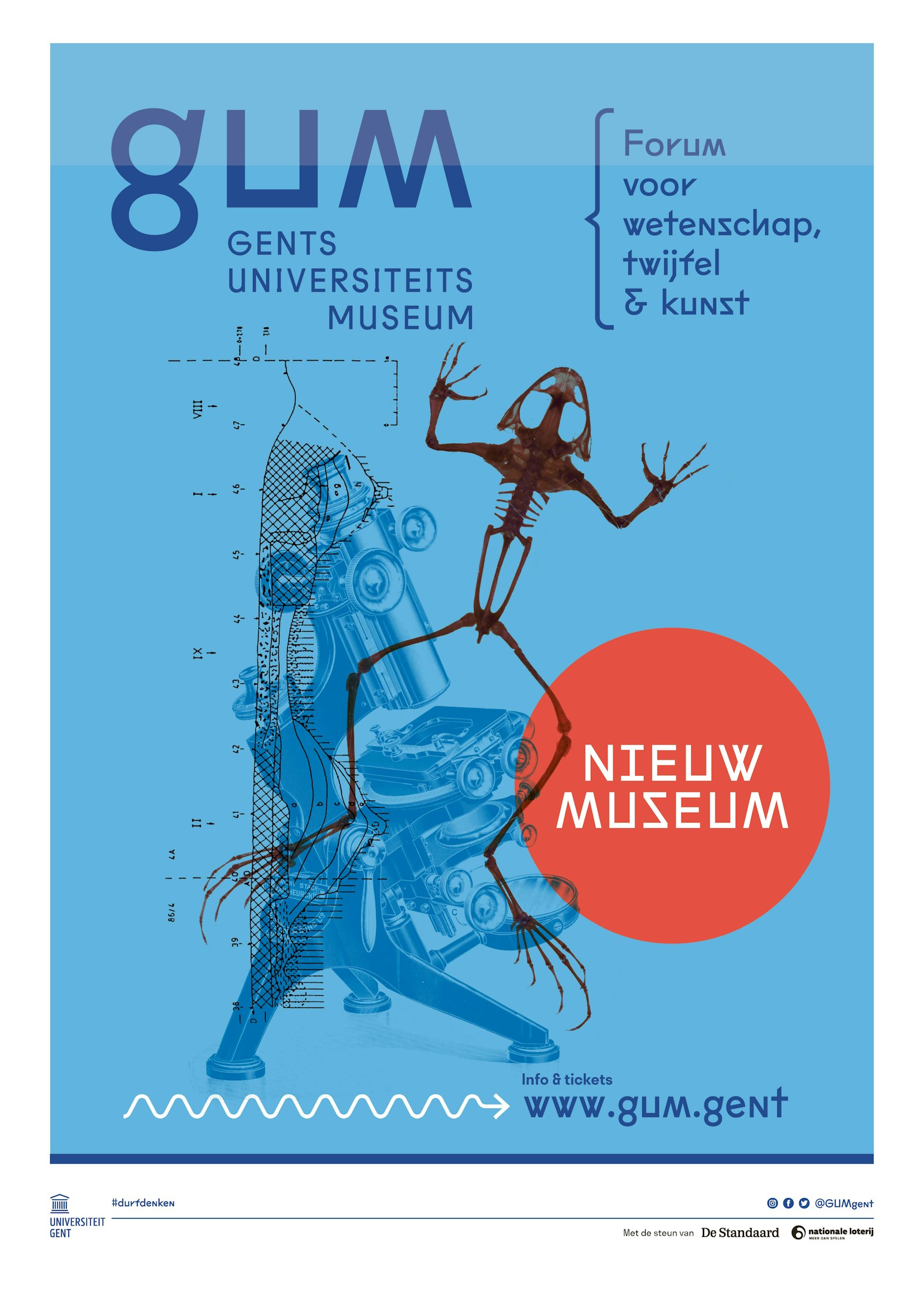
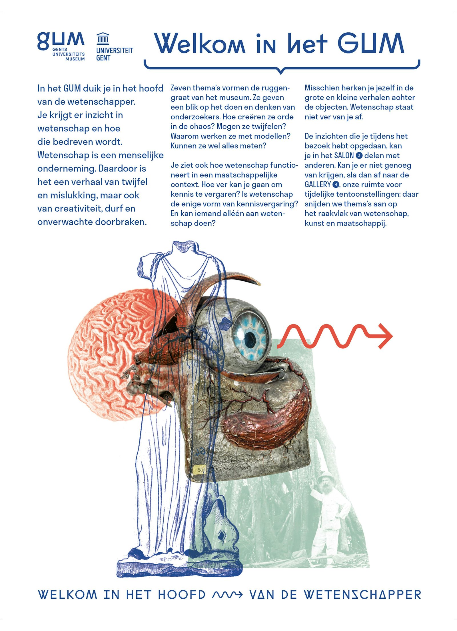
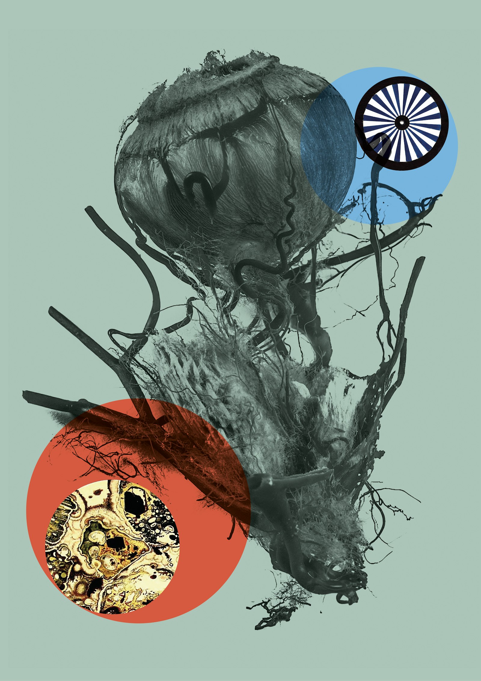
The style that Pjotr developed for GUM is inviting and accessible and contains references to scientific elements. The concept consists of a series of scientific references and collages based on photographs or scans of objects from the museum’s rich collection.
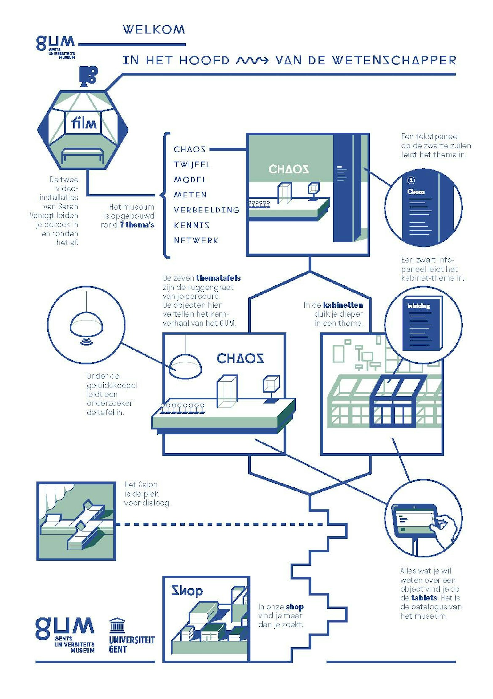
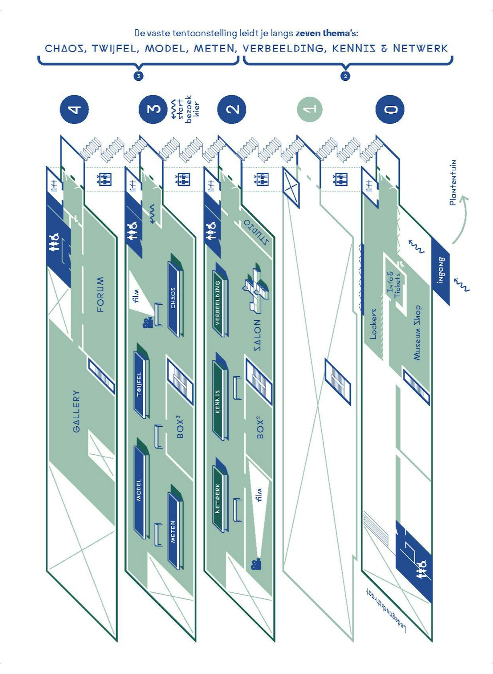
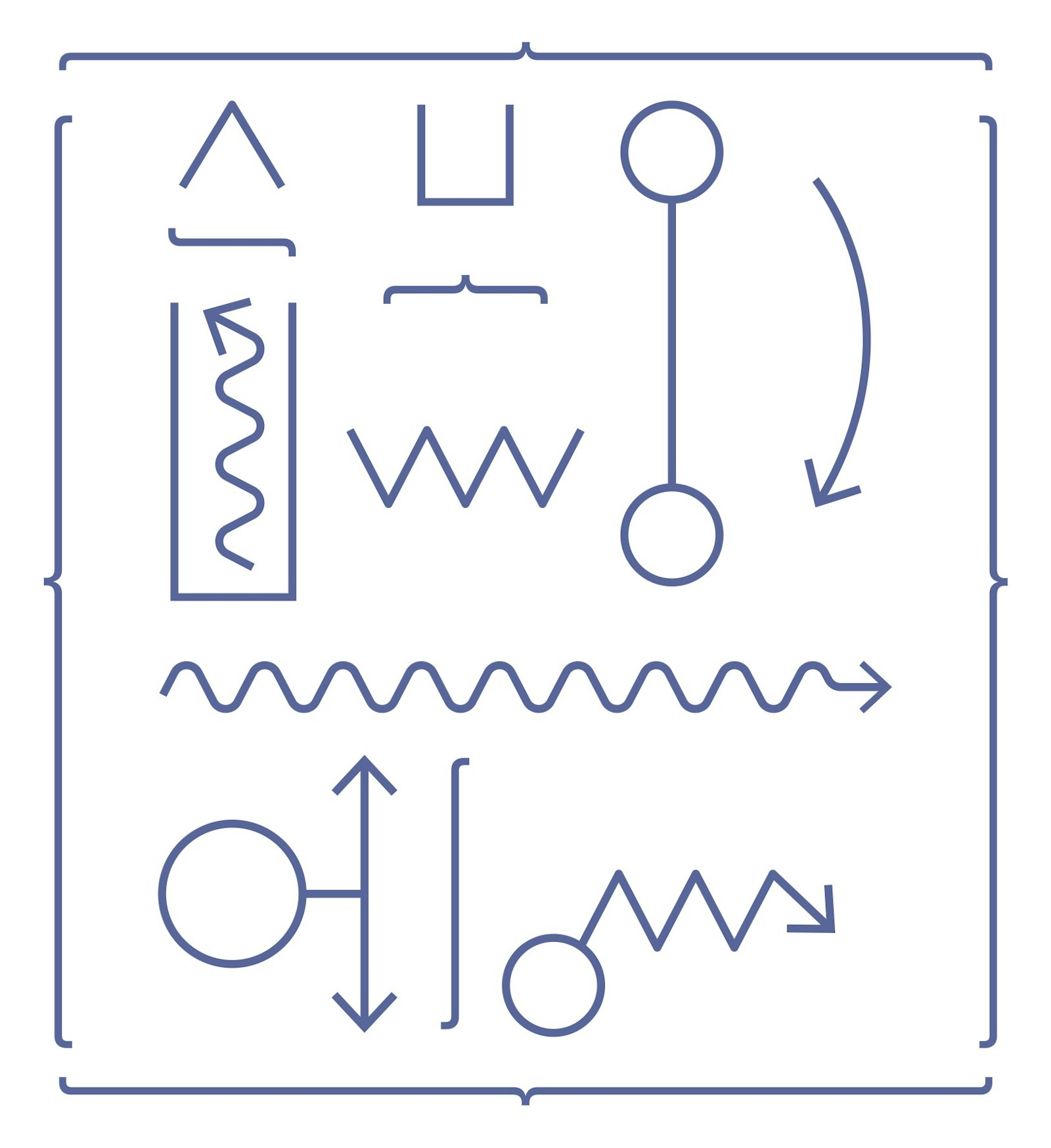
When the Ghent University Museum (GUM) asked Pjotr in 2019 to develop a new identity for the museum, they approached the design process as an open dialogue. After several months of research, several design sketches and exercises, Pjotr came up with a clear concept for the GUM house style, the new logo and the graphic design of the permanent exhibition. The style is inviting and accessible but at the same time complex, layered and poetic and contains references to scientific elements. The font (Fugue Tails) contains characters reminiscent of symbols from chemistry, mathematics or even alchemy. The set of supporting graphic elements (curly brackets, a wavy arrow, etc.) refer to graphs and scientific drawings. The image concept consists of a series of collages based on photographs or scans of objects from the museum’s rich collection. In this way new, poetic, sometimes bewildering images emerge, in which elements from the museum’s cabinets can always be found. The graphic style is reflected in all the graphic expressions of the museum: leaflets, posters, business cards and document folders, and it also finds its way into the museum shop in the form of postcards, pencils, erasers and tote bags. In close cooperation with exhibition architect Koen Bovee, Pjotr also reviewed the permanent and temporary exhibitions and the decoration of the building.
