de Velde
The Icon Project
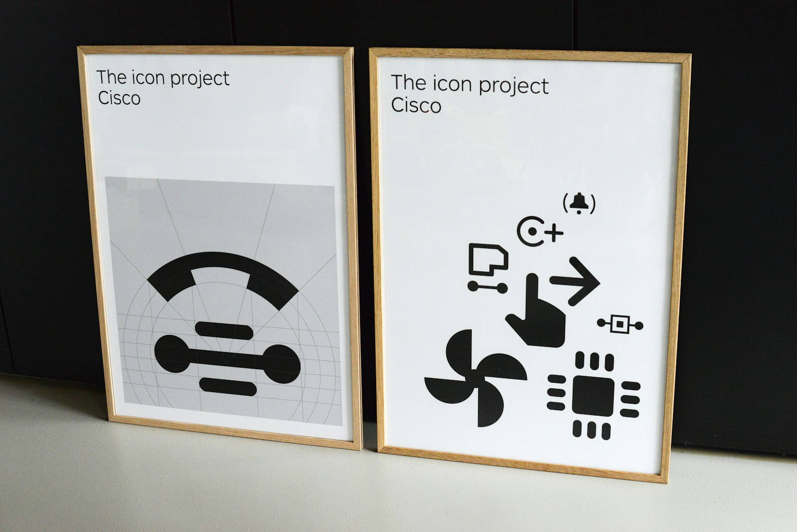
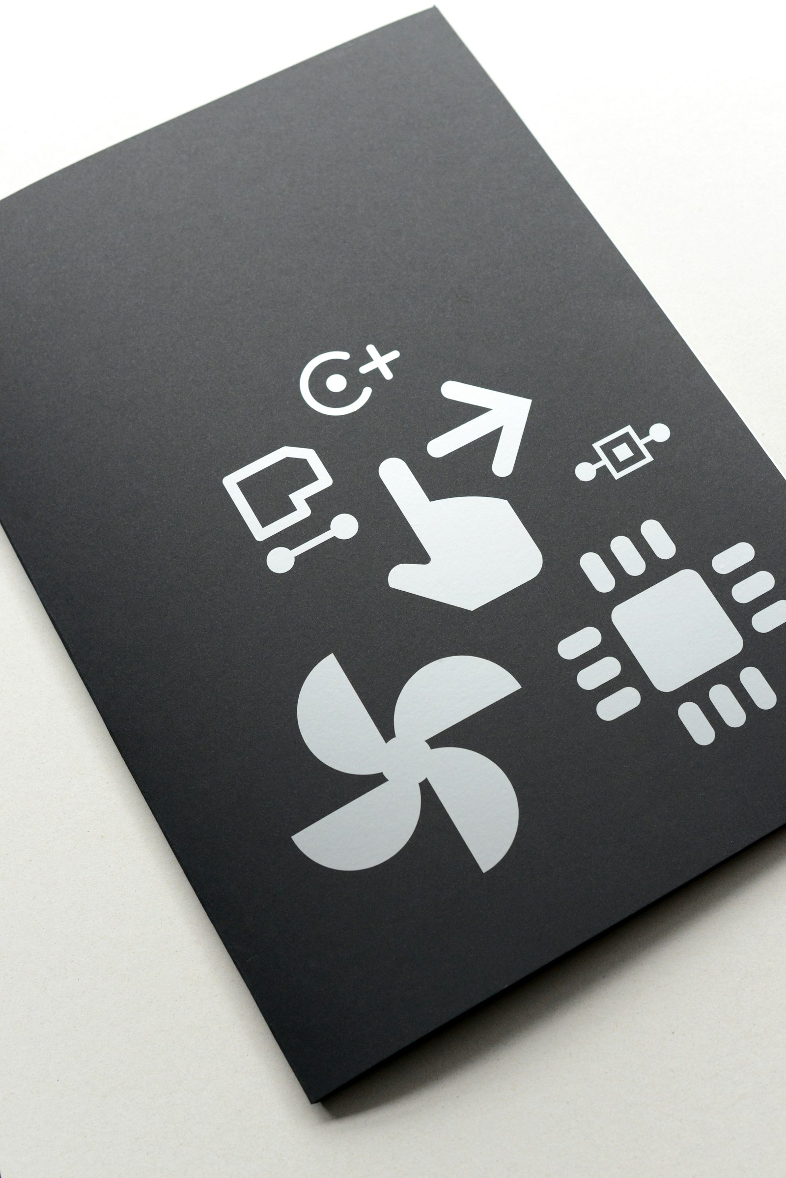
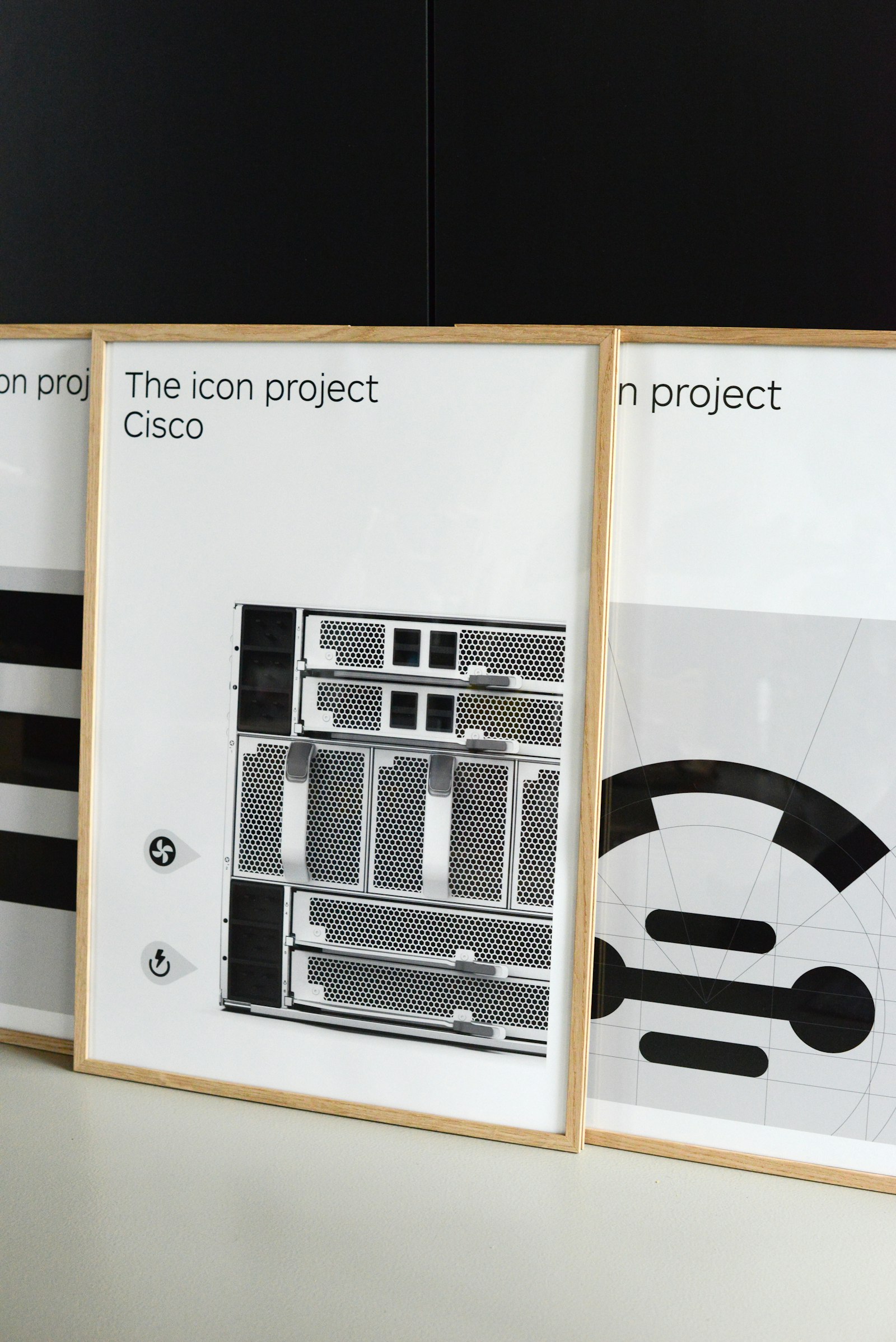
For IT supplier Cisco, graphic agency Kern02 developed a set of simple and inclusive icons that was deliberately kept plain and abstract. The graphically consistent style of the icons has now become Cisco’s corporate product icon style.
In 2011, international IT supplier Cisco decided to no longer represent the connections on a number of their products using letters or words but with icons. Icons are universal and cross-language, making the products less language sensitive and therefore more inclusive.
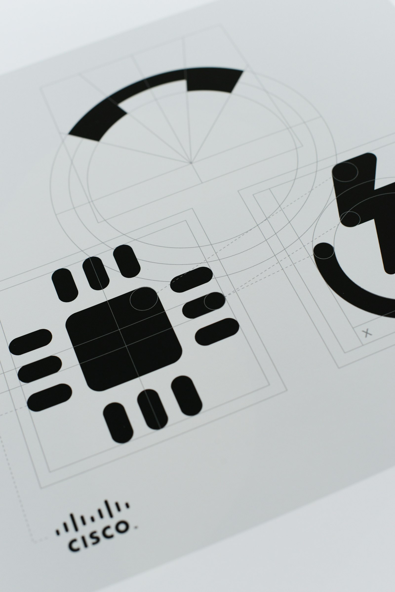
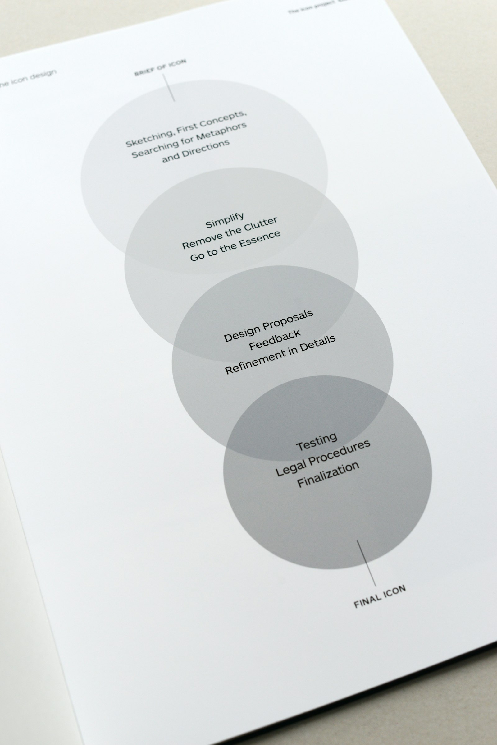
A simple and well-designed icon not only works across languages; it also communicates in a direct and clear way. That was the starting point of graphic agency Kern02, which developed the icons in close cooperation with Cisco. The style of the icons was deliberately kept plain, simple and abstract. Functionality is therefore given priority in the design. The meaning is reduced to the essence. The international application of the icons makes the design process rather complex. There are not only design and feedback rounds of the icons; but there is also a careful examination of whether or not an icon is interpreted unambiguously and correctly in different countries and cultures. The graphically consistent style of the icons has now become Cisco’s corporate product icon style. The style elements are summarised in a corporate icon style guide.
